Heather Corcoran leads outreach for Kickstarter in the UK and Europe, with a focus on the design and technology communities. Based in London, she works closely with innovators, creators and makers who use Kickstarter to bring new products to life. At May’s Hardware Pioneers event in London she offered some tips for designers looking for crowdfunding.
By cultivating relationships with creators and organisations in the hardware space Corcoran and her team had a front row seat at the tectonic shift that has happened in the world of hardware product design, driven by the democratisation of tools to prototype and manufacture, and access to funding.
In the eight years since Kickstarter’s inception, Corcoran has seen, specifically in the design and technology space, over $1bn pledged, 8,000 successful projects and over five million backers. This makes Kickstarter the largest crowding platform in terms of a community of people.
“I’m really thrilled about design and it’s something I care deeply about at Kickstarter,” said Corcoran. “While I’m not a designer myself I can make a case for good design and some of the most successful products on Kickstarter have also won some of the most prestigious design awards in the world. So, successful design goes hand-in-hand with successful campaigns and that goes hand-in-hand with successful businesses long term.” Harnessing the key attributes from some of the most successful Kickstarter projects, Corcoran has compiled five top tips for any designer that is considering crowdfunding.
1. Design for a specific problem
Corcorun explained: “Product design is more than what a product looks like, the material choice and the design language. It’s about solving a problem for the user. But to do that well, you need to define a specific problem that is meaningful to your design process.”
The example given was the Lumos Helmet (above) which won the London Design Museum, Design of the Year 2016, and was brought to life on Kickstarter with the help 6,000 backers pledging $800,000. The product is a bicycle helmet with an integrated light that illuminates when the cyclist slows down and has indicators for right and left turns. The product was conceived in a hackathon by the two founders who were avid cyclists.
Their ultimate problem was that cycling needs to be safer. Of course there are numerous ways in which cyclists are unsafe on the road and so this is a very broad issue. They needed to break the problem down. Their research and experience found that drivers tend to get confused over the unpredictability of cyclists on the road to the extent that they didn’t know where they were heading next, which can cause accidents. “They really honed into that problem, so the Lumos team really designed for a specific problem,” Corcoran added.
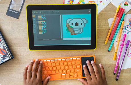
2. Design for the whole product experience![kano]()
A good example of this is the Kano Computer Kit, a simple kit to make a computer and learn to code, which won the Cannes Golden Lion award in 2014. Corcoran continued: “They really took the time to merge product and packaging into one seamless experience. Their design strategy was to make their design intuitive and accessible for children with lots of custom colour coded parts. Their packaging design was well suited for neat storage as well as being able to fit through a letter box. The process was really about creating a brand experience across the whole product. Hardware companies (perhaps more so than software companies), need to be better at building total brand experiences.”
3. Design with a community
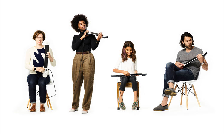
The creators of Artiphon Instrument 1 got this right after raising $1m on Kickstarter. The project is a musical instrument mini-controller, or keytar, for the modern age with a user interface that allows for a variety of different user experiences – strumming, sliding, tapping, etc. “The interface is very important to musicians,” added Corcoran, “So throughout the development process, Artiphon worked very closely with musicians to test the product and to see what they could do with it. The musicians didn’t just feed into the development of the product but, at the crowdfunding stage, the company could draw on that community of musicians for testimonials, to be their earliest backers and to be their most ardent supporters, which was very powerful.”
4. Iterate your product design
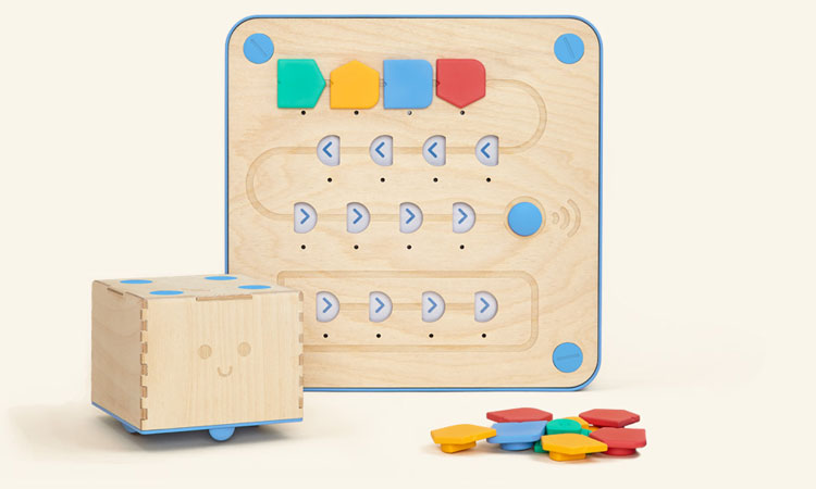
“This can be very difficult for startups to swallow, but a good example would be the Cubetto (below) which is Kickstarter’s largest educational-based project that teaches children the fundamentals of programming logic,” Corcuran continued. “It won the Red Dot Design Award 2016 among others. It was launched originally in 2014 as a kind of build-your-own kit, but they built a community and a network and came back to Kickstarter with their next project two years later, which was the one that broke all the records. So maybe you don’t need to take such a huge step in the first instance. Maybe you can get a project to market in stages and learn at each stage.”
5. Know how to tell your product story
This is something that all of these examples have in common. It’s a real skill and one that Corcoran considers to be an important part of the design process.
“Start with the basics rather than a long list of features,” she added. “Distil your product’s features and prioritise them into the top one to three core features rather than ten plus. Don’t just include technical features and consider the user experience and the user benefit that you are enabling with that feature. You should also define the value proposition, and if you get these things right it means that you really know what your product is all about and the other things that you’re trying to communicate will fall into place.”


Comments are closed, but trackbacks and pingbacks are open.